
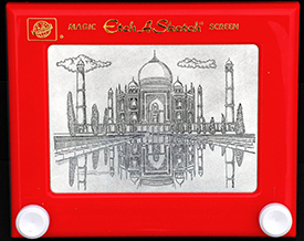
I'm not willing to accept the excuse that because it's in PowerPoint we can't make it look good or that we're limited in some way. Ever since David Byrne took a turn at creating art in PowerPoint, I've liked the idea of embracing it as a challenge. If people can manage to create art on something like an Etch-a-Sketch, PowerPoint shouldnt prove a barrier to creativity. Anyway, there really are no limitations, pages can get formatted in any aspect ratio you like, color is as limited as RGB, animation keeps stepping up, and clever use of it can get you close to the elegance of credits in a high-budget, Hollywood flick. And, if and when you do feel a creative pinch just import: movies, eps, png. There are really no excuses for not produce any visual experience with whats available in PowerPoint.
 On Little Touches
Whether you are working on a single slide deck or building professional powerpoint templates,the devil is always in the details, and in all those little touches that enrich the visual experience. Where the big things are the "what", the little things are the "how" in your design. The "what" might be very interesting - a new product, invention, innovation, process, something that will change the world, or maybe just a quarterly financial report. Either way the 'how' speaks volumes about the intent, capabilities, and even the quality of the presenter and what they are trying to present. All the little nuances are an expression of the presenters attention to detail and execution. After all, this "big" idea needs to be presented in a convincing manner. No matter how convincing a person you are the quality of your presentation relies heavily on the quality of your PowerPoint deck. Is the animation smooth, appropriately paced - not too quick or too slow? Are the designs balanced and is the emphasis put on the right elements? Is there too much information? Is the onscreen content well structured? Does your audience look where you want them too? And see things in the right order? You're asking for consensus from your audience, is there consensus among your slides? A good PowerPoint deck should be well structured, easy to follow and designed in a way that reflects the quality of your content. These are the aspects rarely commented on but ones that carry a strong impact. The little details in a presentation are what come together to give your audience a feeling of the material and can serve to draw them in or push them away.
Bringing It To Life
A giant word, a gorgeous photograph filling the screen, a sweeping gradient or just a solid color. Movies, concerts, paintings, these are a few of the things that we regularly view on a large screen. Why would we hold our presentations to a lower standard? Obviously there is a difference between your big idea, your quarterly financials, and the latest blockbuster but why not learn from the experts in dramatic visuals? Sure, a presentation isnt going to accomplish much just by looking nice. But regardless of your subject, every presentation is telling a story, and the right visual elements, use of animation and design can help tell that story effectively and present a more compelling narrative for your audience.
Do you think PowerPoint still has room to breath or are new applications going to make it obsolete? We look forward to your comments, and encourage you to download the presentation tips guide below.


