Arne Hurty

Arne is Creative Office and Founder at BayCreative
Find me on:

Recent Posts

Marketing Design with Some Breathing Room

Posted by Arne Hurty on Aug 31, 2015 3:45:51 PM

You can find a lot on conversions and ways to improve conversion rates. What less obvious places can marketers look to improve conversions? Here are a few words on the topic of “white space” in the design. Any designer and many marketers will have heard this term and understand that to mean open area in a design. This is a design oriented topic but relevant to maketers. And can have a big impact on the experience your prospects and customers have.

Read More

Topics: website design and development, graphic design, b2b marketing

The explainer video and what’s next?

Posted by Arne Hurty on Jul 31, 2015 3:58:00 PM

The “explainer” video has become quite the thing. It’s a staple for business marketing as sure as a website, an email address, a phone number is. So what makes it an explainer. It’s not a demo video which shows you how something works. It’s not a tutorial which instructs you on how to do something. 

Read More

Topics: video, Presentation, customer experience

Start with your messaging

Posted by Arne Hurty on Jul 28, 2015 12:13:00 PM

Let’s say you don’t have a brand manager or a director of lead gen or social media manager. But your executive team understands there is value in all those things and somebody taped a message to your back when you weren’t looking that says "Kick me - I love marketing!" So where do you start. The sales guy wants leads “send out some emails or start a pay per click campaign or something like that” he says. Your CEO wants that sexy PowerPoint presentation he’s never been able to quite pull together. And everyone and their mother is clamoring for “social media.”

Read More

Topics: marketing strategies, Messaging, b2b marketing

Scroll leaves fold behind

Posted by Arne Hurty on Jul 20, 2015 3:05:00 PM

Regardless of what we are developing a web experience for—awareness, engagement, conversion, sales—we inevitably get questions from people about the fold. Traditional wisdom had it that above is prime territory. For a good few years that thinking has shifted, supported by anecdotal evidence as well as a load of great studies (here is one article that references two studies that present slightly differing views). This shift is credited primarily to the arrival of finger scrolling, which has become second nature to people and universally accepted by every manufacturer and designer.

Read More

Topics: website design and development

Web Design Efficiently

Posted by Arne Hurty on Jul 6, 2015 10:39:00 PM

Efficiency is always desirable in business. Especially when working on projects that out of the ordinary and not done very often, like a website redesign, efficiency might seem harder to accomplish. And when it comes to a highly creative process like graphic design, it may even seem contradictory to focus on efficiency. First off a website redesign can mean so much - everything from an esthetic “face lift” to completely overhauling a collection of e-commerce, accounting, marketing, and management systems. In the end, everyone involved wants efficiency. Being efficient means schedules and budgets get met. The less familiar a project is the more efficiency might seem to be a challenge. A design project - a web design project - is, for most businesses, just that sort of a project. A situation where ways to achieve efficiency are not so obvious.

One place where the efficiency of a design project becomes very visible is in the approval of the graphic designs for a web site. It inevitably becomes a moment of heightened emotion, primed with anticipation, and hopefully a minimum of drama. Weather or not this step is efficient depends on a few things.

1) How well has the process itself, for design review and approval been clarified and considered?
2) How clear is the criteria for evaluating design? Is it going to be based on a person’s subjective likes and dislikes or is it based on objective criteria?
3) How thoroughly has design style in general been reviewed and design sensibility been understood?

Process for web design
What’s helpful here is an outline of the steps taken to achieve an excellent design and the reason for them. Regardless of how different or unusual any particular creative approach might be, there ought to be reasons for all of it and it should make sense to everyone. For example, the process might involve the use of some creative device, like a “mood board” (a collection of colors, textures, images, words, ideas presented to open up the thinking about the design). With a clear explanation about this, what everyone’s participation ought to be, and what everyone should come away with, this becomes an effective and efficient step.

Criteria for Design
A big contributor to efficiency in the design process is setting the criteria for evaluation. How do stakeholders decide if design is good, inadequate, exceptional, absolutely off track? It comes down to a clear understanding of the purpose of the design, and this often comes down to the purpose of the business itself. It’s important to know what this design is for. Is it simply a modernization of an outdated design? Is it to facilitate new business goals for sales and engagement? Is it to make a particular impression on a specific target audience? Some combination of all of these? If taken for granted there is a risk that design is flying blind weather it’s amazing work or not, no one will be able to assess that. On the other hand, with a clear understanding of these broader goals and possibilities, there is a way to evaluate new designs and make better recommendations during design review.

Design style and sensibility
It’s easy for designers to get lost in their own jargon. Combined with the difficulty stakeholders have expressing their thoughts on design, you have a recipe for frustration and wasted time. No need for this. We live in a world where everything is at our finger tips including websites. Take full advantage of this and do a deep dive into different sites and different site designs. Get a sense of what the team likes and doesn’t like. Find out up front if someone is made seasick by certain colors or if certain things are flat out deal breakers. In addition to vetting out some basic do’s and don’ts this is also an opportunity to establish a baseline for communicating about design.

Read More

Put experience at the heart of your marketing

Posted by Arne Hurty on Jun 27, 2015 10:26:03 PM

How do you connect with your market? That's the question at the heart of marketing. There are many channels and methods to use, digital and otherwise. An explosion of digital devices and the arrival of IoT extends the opportunity to connect, expanding the digital realm. The so called traditional media of print, television, and radio continues to evolve, stubbornly refusing to accept obsolescence. Apps, websites, social media, events, commerce, all make for a complex landscape for a brand to participate in in a meaningful way.

Testing for results lets you navigate all this, of course. Test, measure, and throw your marketing spend at what works. It’s a defensible approach, it’s safe. But you might find yourself shortchanging inspiration and spontaneity if that's your only tactic. The “stuff” of engaging relationships is spontenaity, fun, challenge.

Read More

Topics: Branding, marketing strategies, customer experience, user experience

Graphic Design During the Webtop Revolution

Posted by Arne Hurty on Mar 8, 2013 11:23:00 AM

I lived through the desktop revolution. As a graphic designer I was definitely a rebel, on the front lines. Back in 1985, I made having a MacSE, a condition of taking any job. Exciting times. Typesetting shops were turning into digital prepress houses. Rapidograph pens, mylar, and stat cameras, were all rapidly becoming things of the past. Having drunk the Kool-Aid, I spread the word in my own way. I vividly recall indoctrinating my professor from UCLA, who also ran a high-end book-publishing house. I invited him to stop by after work one evening to spend a couple hours with me, and Aldus PageMaker. A message came a week later that he'd traded out all his drafting tables for Mac II's and PostScript printers.

Graphic design is more important than ever
Read More

Topics: inbound marketing, quality design, graphic design

Is Content Still the King?

Posted by Arne Hurty on Feb 16, 2013 4:42:00 PM

We've all heard the phrase content is king and have an idea of what that means. In the context of the web it has specific meaning regarding the value of SEO. Search providers (Google, Bing, etc.) seem to be changing the game on us with sophisticated technology like Panda. The underlying goal is straightforward enough—delivering relevant results on searches. After all, that's how they stay in business. Keeping that in mind makes it easier to concentrate on what matters in SEO. However, with the way search engines are changing, is it possibly time to reconsider the statement 'content is king?' Could user experience become the main focus? 

experience is king
Read More

Topics: strategic marketing, SEO, Content Development, creative marketing, inbound marketing

PowerPoint presentations need less text, and more presentation

Posted by Arne Hurty on Feb 12, 2013 2:46:00 PM

Since the days of the Roman Senate there has been no shortage of advice on the subject of presenting, oratory, speeches, etc. In this blog we'll zero in on one small part of that bigger universe: presenting with a PowerPoint slide deck. Too often we wind up in meetings watching slide after slide of densely packed text and poor visuals. Your mind wanders. You lose focus. A poorly designed slide deck, and a poorly designed presentation, can rob the very life out of your meeting, derail your vision, and undermine the value of what you have to say.

powerpoint presentations presenter slides
Read More

Topics: Power Point, Presenter, Presentation, PowerPoint, slide deck

PowerPoint Design - Limited by Creativity, Not Technology

Posted by Arne Hurty on Nov 20, 2012 2:07:00 PM

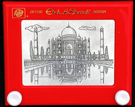
I'm not willing to accept the excuse that because it's in PowerPoint we can't make it look good or that we're limited in some way. Ever since David Byrne took a turn at creating art in PowerPoint, I've liked the idea of embracing it as a challenge. If people can manage to create art on something like an Etch-a-Sketch, PowerPoint shouldn’t prove a barrier to creativity. Anyway, there really are no limitations, pages can get formatted in any aspect ratio you like, color is as limited as RGB, animation keeps stepping up, and clever use of it can get you close to the elegance of credits in a high-budget, Hollywood flick. And, if and when you do feel a creative pinch just import: movies, eps, png. There are really no excuses for not produce any visual experience with what’s available in PowerPoint.

Great things can be made with simple tools
Read More

Topics: quality design, Presentation, PowerPoint

contact-bc2.jpg

Subscribe via E-mail

Follow BayCreative

Download our free Guide: 7 Steps for Successful Websites

Latest Posts